Apter
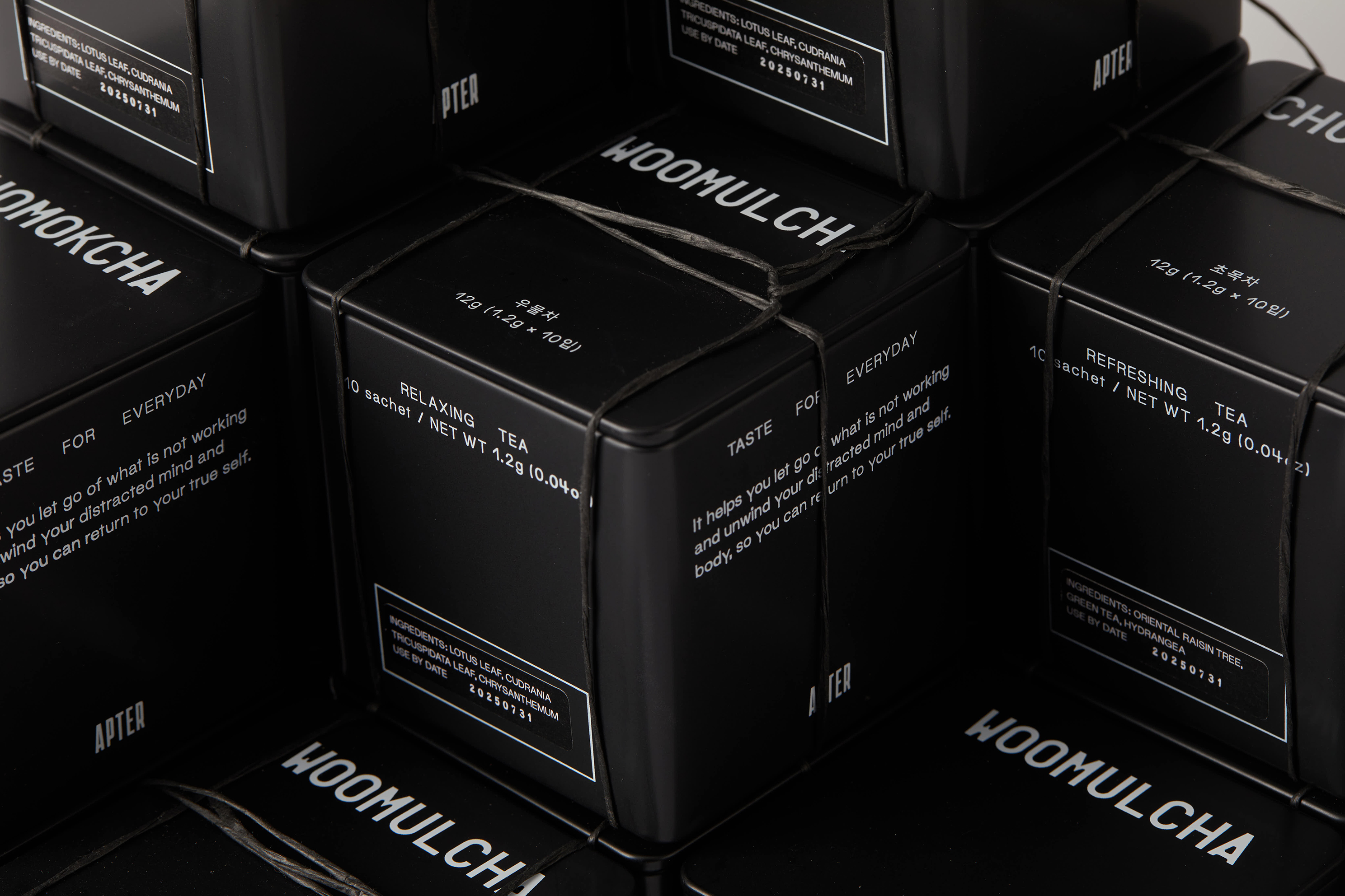
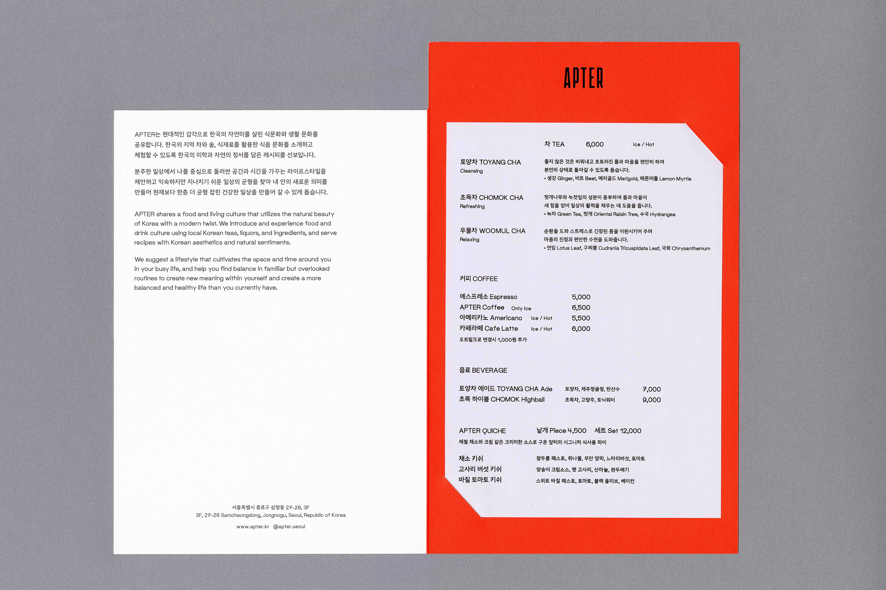
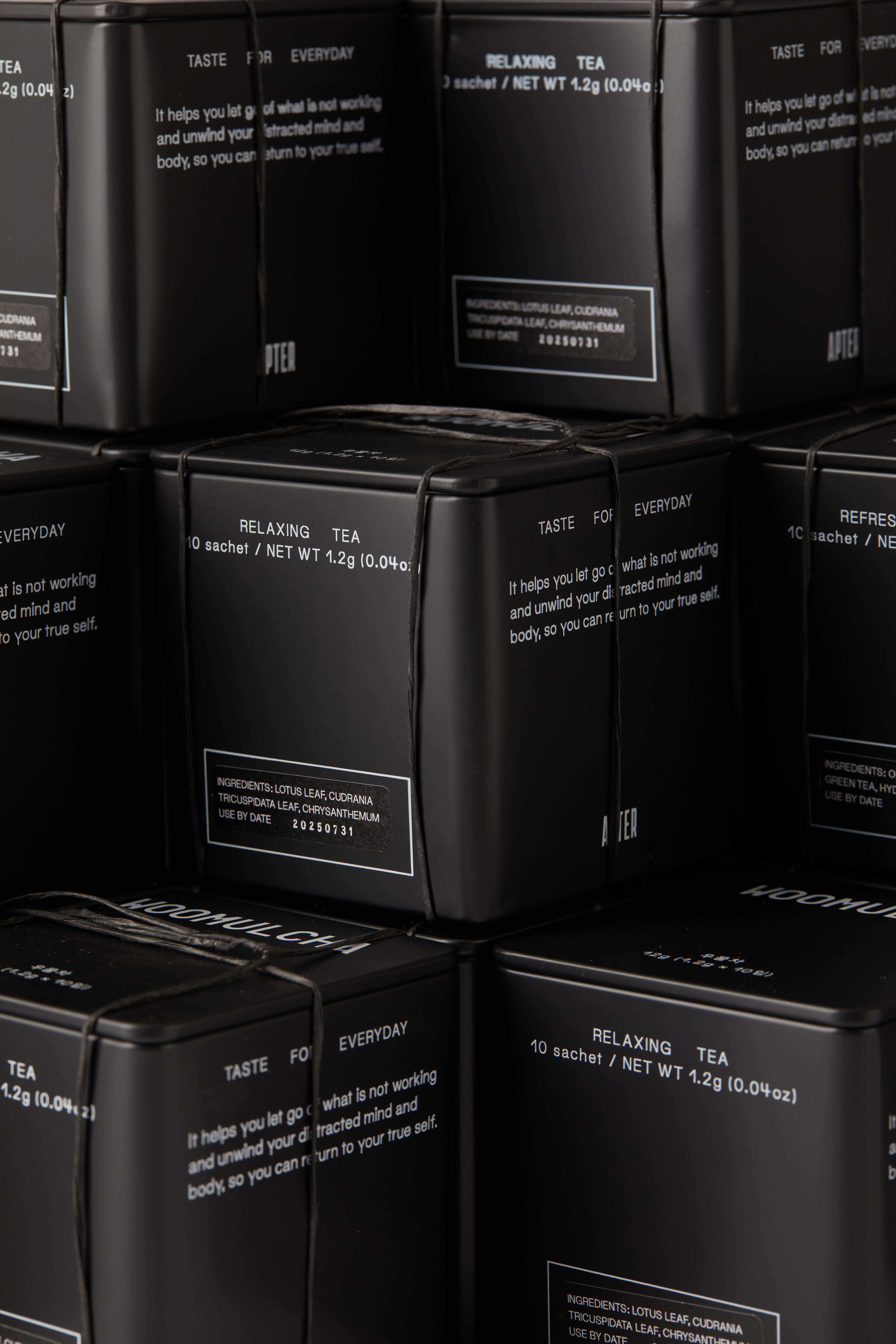
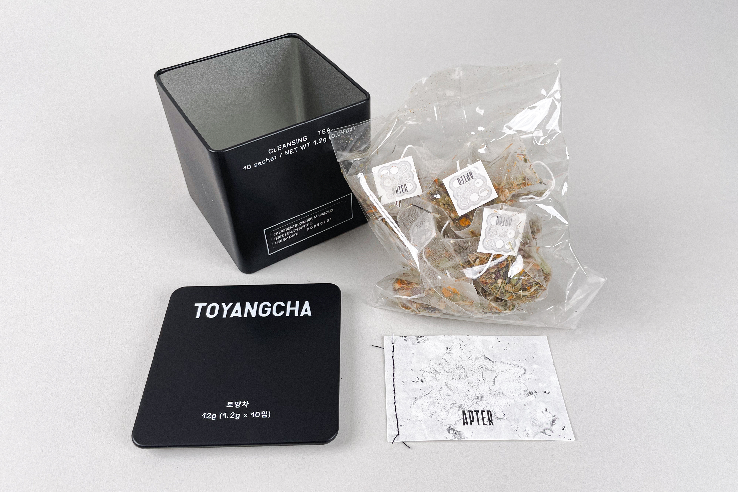
Apter shares a food and living culture that utilizes the natural beauty of Korea with a modern twist. It introduces and experiences food and drink culture using local Korean teas, liquors, and ingredients, and serves recipes with Korean aesthetics and natural sentiments. We were commissioned to design the brand identity, signage and tea package including tea names, printed materials and the copywriting for text.
앞터는 한국의 자연미를 현대적으로 재해석한 식문화와 생활문화를 공유합니다. 한국의 차, 술, 식재료를 활용한 식음료 문화를 소개하고 체험하며, 한국적인 미학과 자연의 정서를 담은 레시피를 제공합니다. 이에 맞는 브랜드 아이덴티티부터 사이니지, 차 이름 (토양차, 우물차, 초목차), 인쇄물, 텍스트 카피라이팅을 포함한 차 패키지 디자인을 의뢰받아 전반적인 비주얼 디자인을 긴밀하게 의논하며 진행하였습니다.
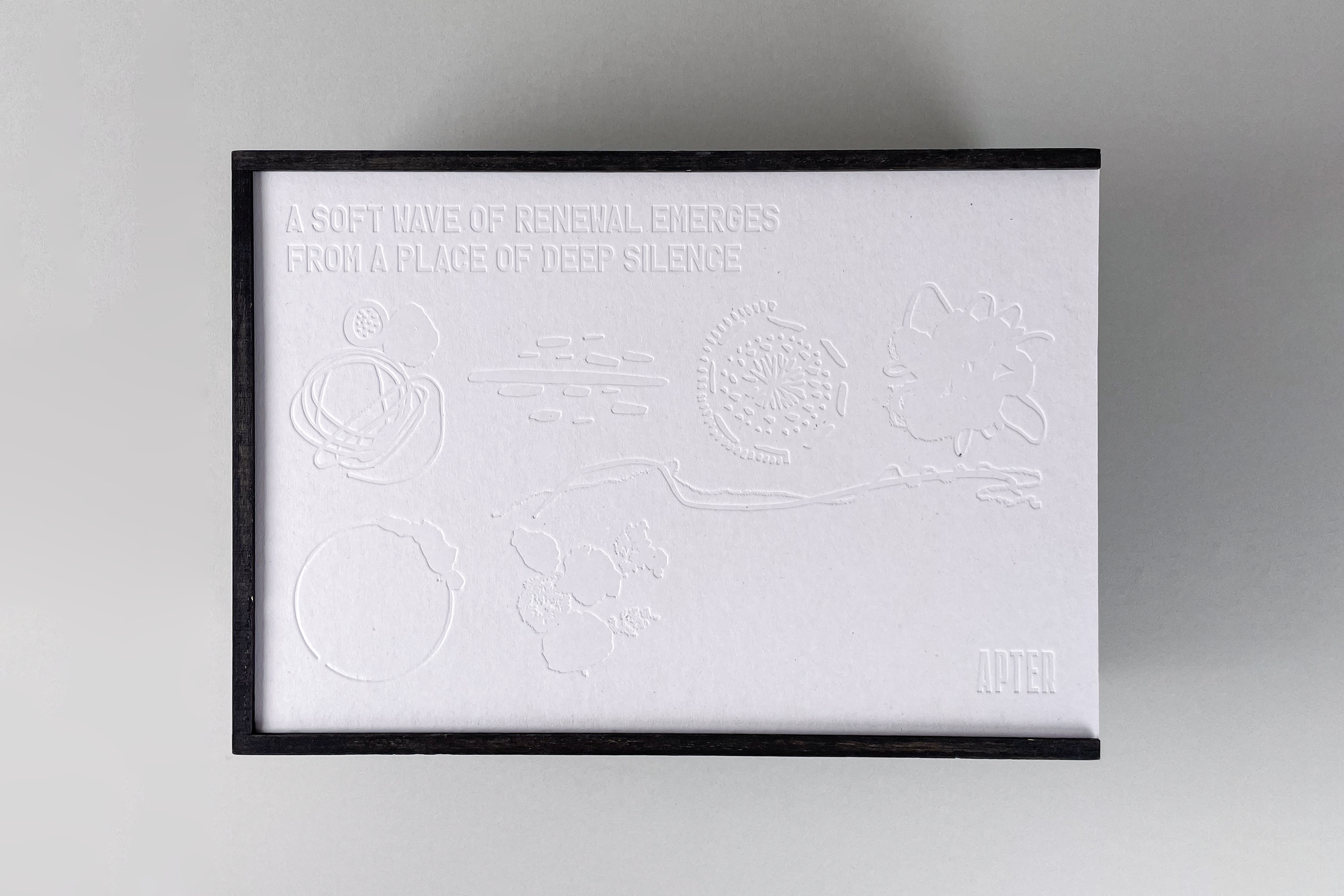
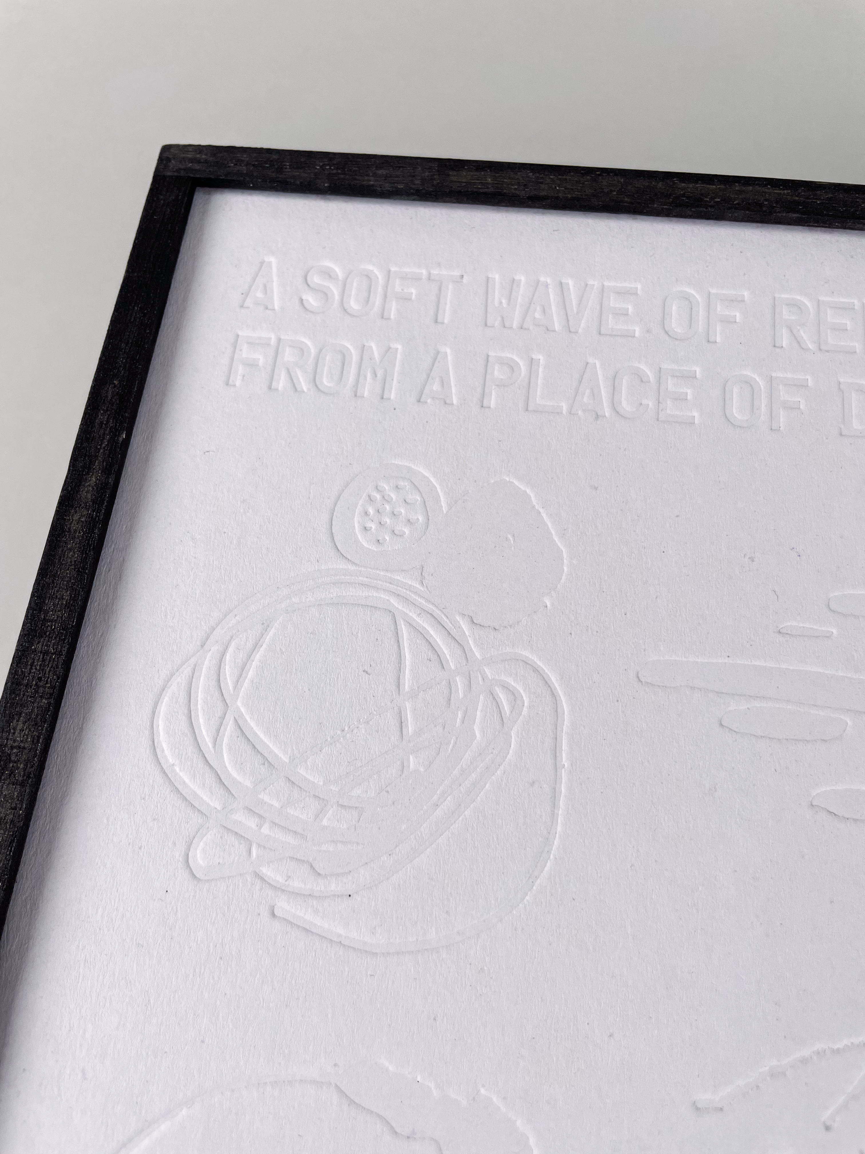
We devised a visual language of Apter (앞터) as surrounding spaces around our home in traditional and ordinary korean life. By utilizing the texture and morphological features of objects and materials that are reminiscent of natural objects that can be found in the front yard (soil, stones, rocks, streams, grass, flowers) as visual elements, the image-centered development is carried out, and the rough and unadorned natural mood of the impression of the Korean front yard is added to visualize it in a concise and modern way, showing a different tone and manner from the similar but fancy Western garden.
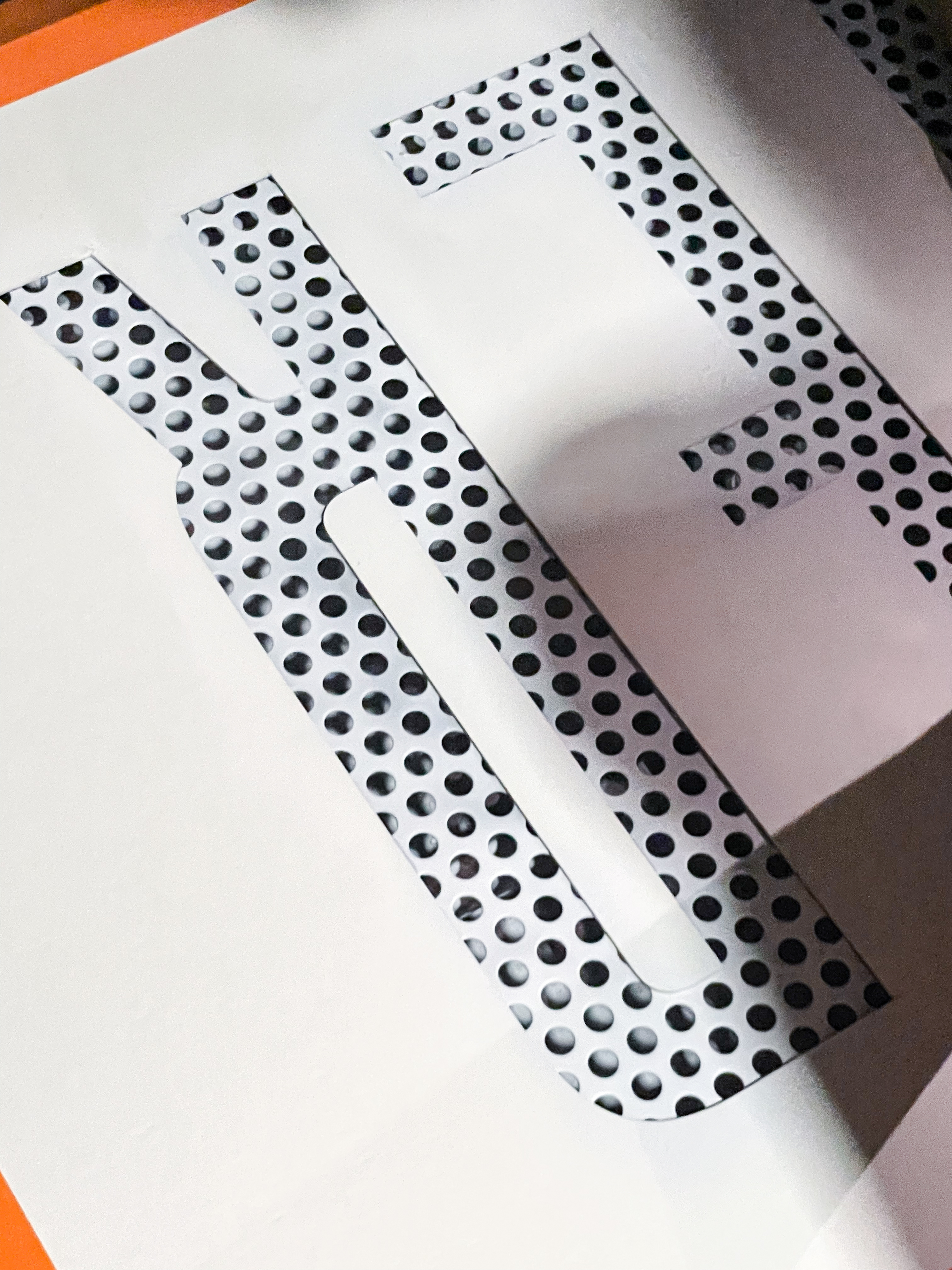
The main graphic elements inspired by positive and negative spaces and organic forms of the sculptures of Isamu Noguchi’s works, which are informed texture and patterns used throughout the brand identity and printed materials.
전통적이고 일상적인 한국인의 삶 속에서 집 주변 공간인 '앞터'를 시각적 언어로 어떻게 해석할지 고민하면서 앞터에서 흔히 발견할 수 있는 자연물(흙, 돌, 바위, 개울, 풀, 꽃)을 연상시키는 것과 소재의 질감과 형태적 특징을 활용해 전개하고, 한국적 앞터의 인상인 거칠고 꾸밈없는 자연의 정취를 더해 간결하고 모던하게 전달하면서 화려한 서양의 정원과는 닮은 듯 다른 무드를 담아내고자 했습니다.
메인 그래픽으로 쓰인 패턴 모양은 앞터에서 그린 여러 드로잉 소스를 가지고 이사무 노구치 (Isamu Noguchi) 조각 작품의 양과 음의 공간을 활용한 유기적 형태와 같이 컨셉과 연결되도록 재편집을 통해 브랜드 아이덴티티와 인쇄물 전반에 쓰인 질감과 패턴으로 적용시켰습니다.


Photography of product by Yose.thesedays
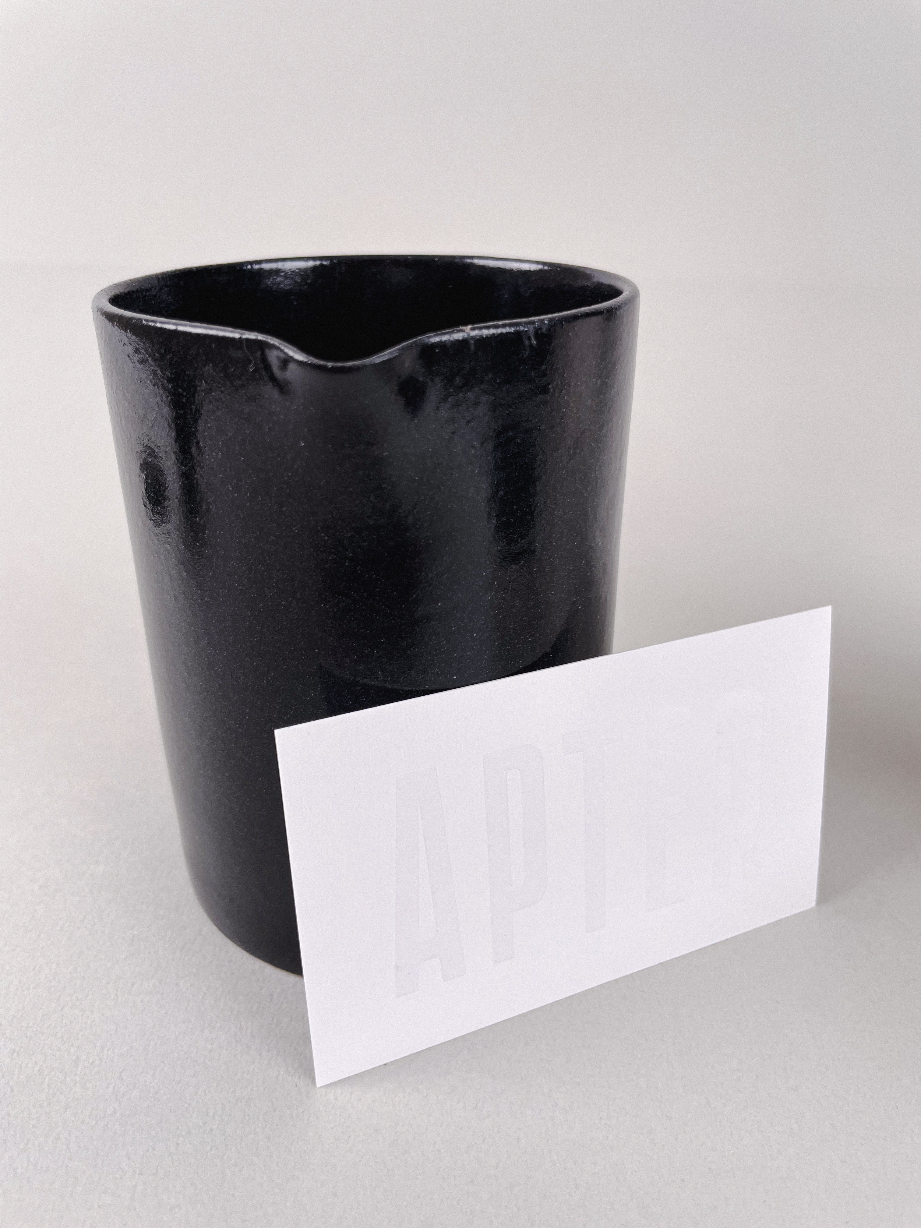
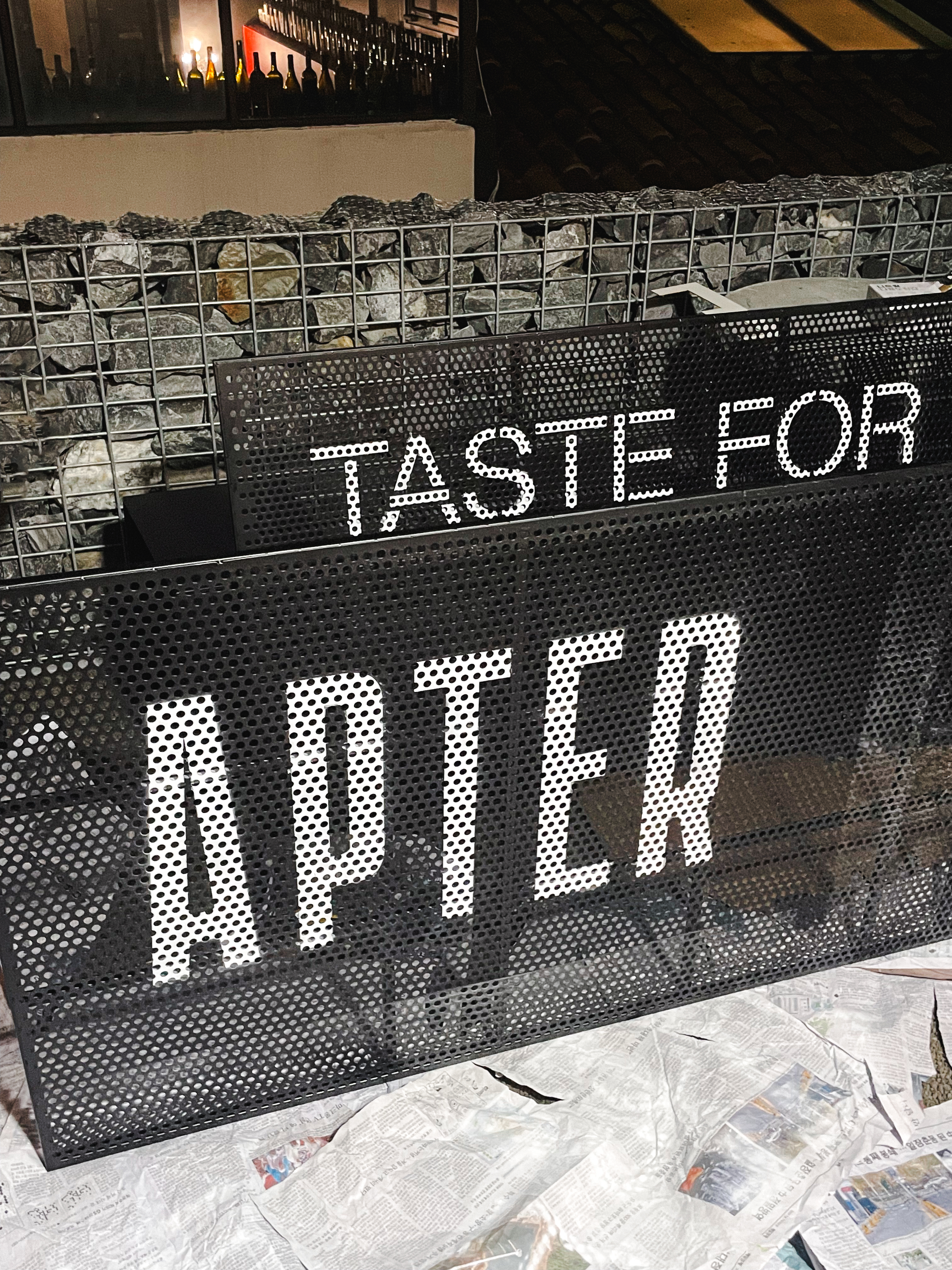
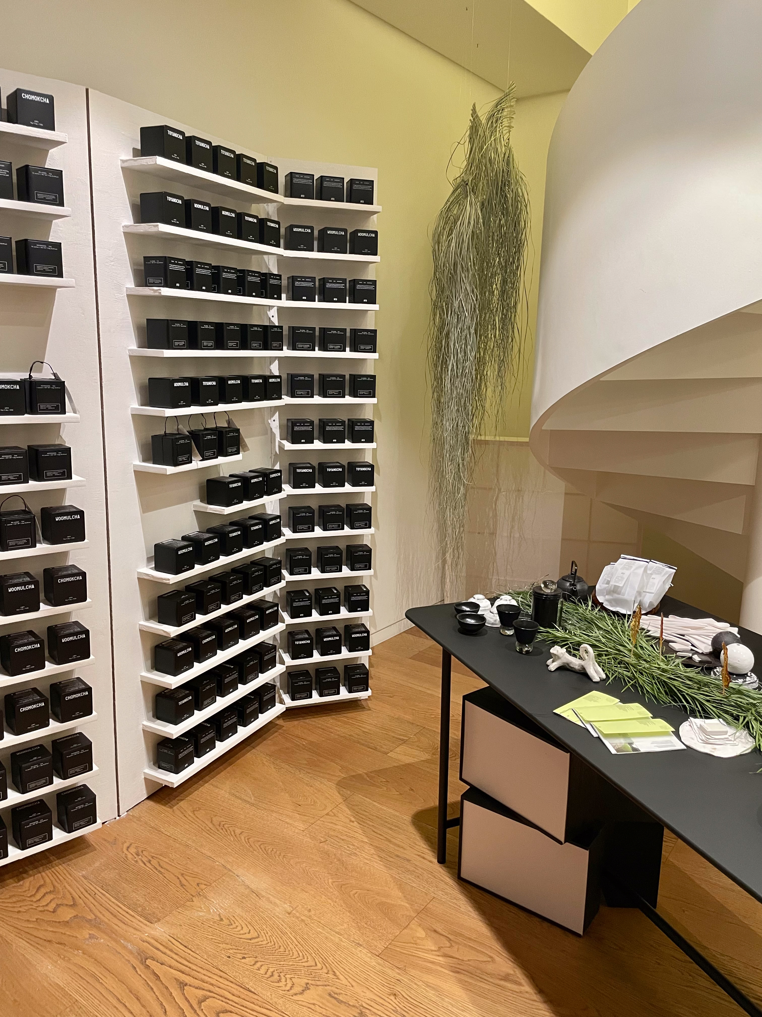
We worked closely with Apter’s in-house ceramic designer to bring the design from concept to realisation, and in addition designed all signage throughout, created a labelling system for the tea package, and devised a brand broucher for business including some photographs in use which taken by us.
앞터의 세라믹 디자이너와 긴밀히 협력하여 디자인부터 제작까지 크고 작은 사이즈의 간판을 만들고, 차 패키지의 라벨링과 카드와 같은 인쇄물을 맡아 전체적인 아이덴티티를 연결지었습니다. 더불어 파사쥬에서 촬영한 사진을 포함하여 브랜드 무드를 표현하는 비즈니스용 브랜드 브로셔의 디자인을 맡았습니다.
Identity, signage, printed matters and package design (2023)
Client: Apter
Client: Apter
Typeface for typography
ENG
Numberplate LL-Belgium by Lineto
Maxeville by SM Foundry
KOR
Min Gothic by Park Mingyu
ENG
Numberplate LL-Belgium by Lineto
Maxeville by SM Foundry
KOR
Min Gothic by Park Mingyu