TRDST
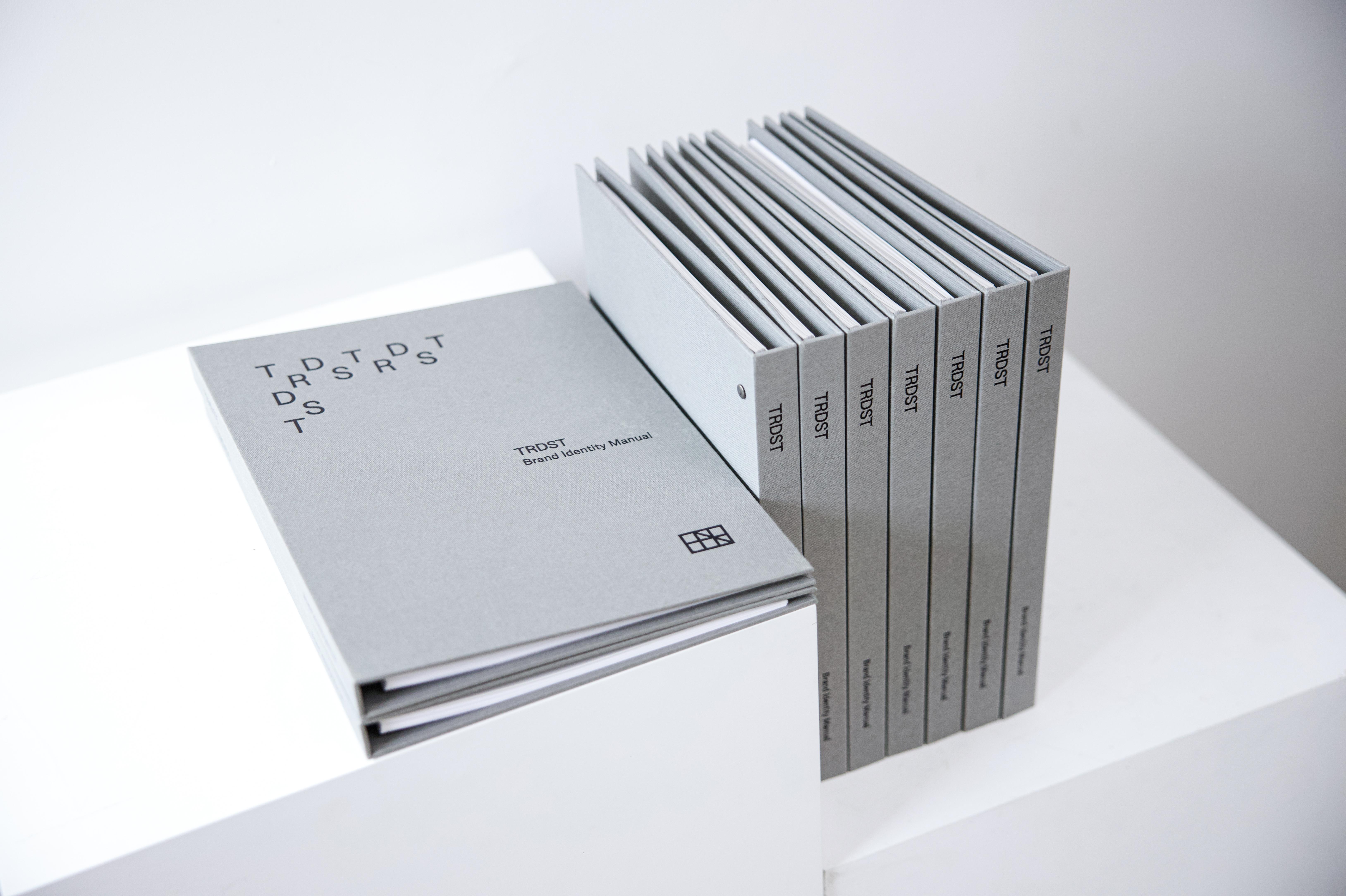
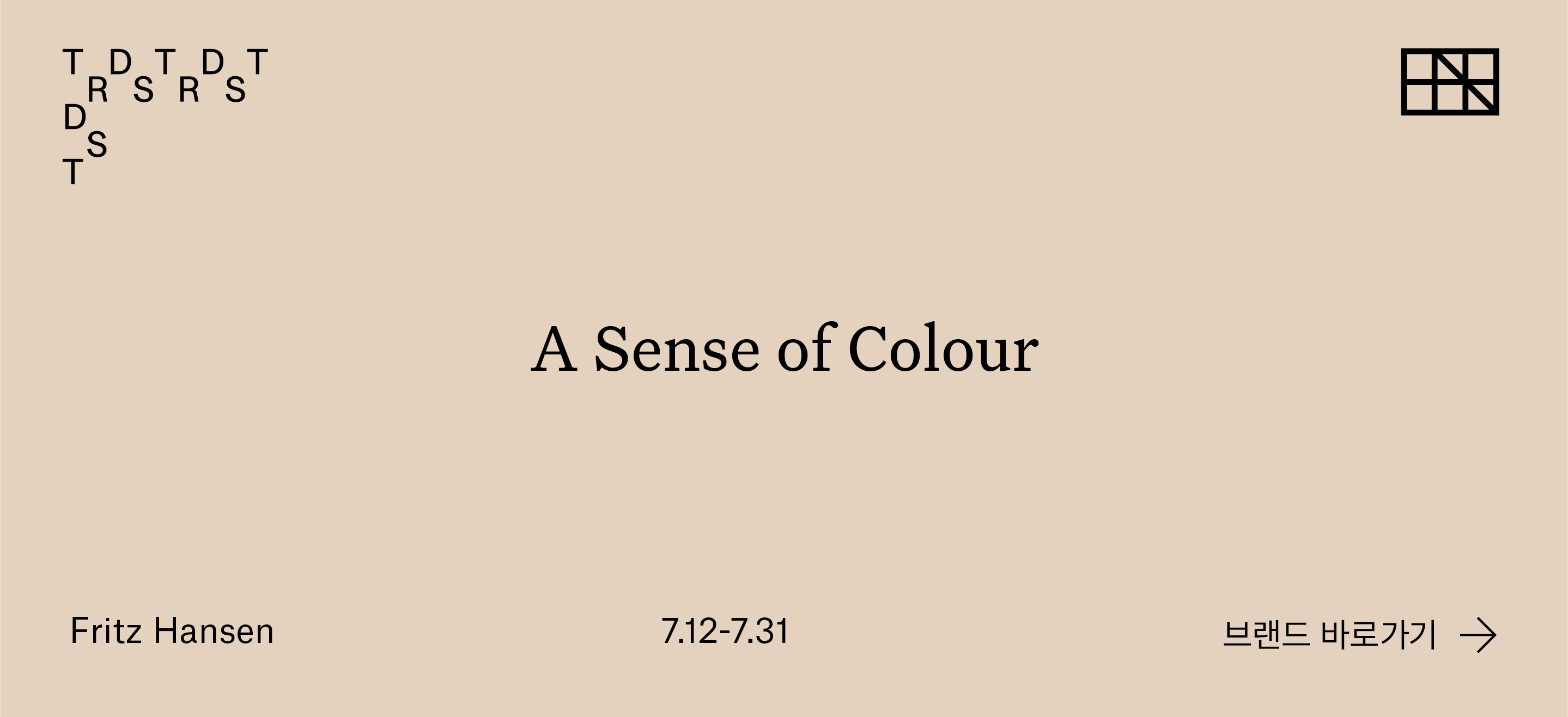
TRDST is an online platform selling premium furniture brands in a clever and effortless way. The attitude to face the design product that fully considers the gaze of a person is the reflected idea within the identity. Identity refines exaggerated or decorative elements to practical and natural concise beauty. We were commissioned to design a new visual identity for the brand, incorporating a logotype, stationery and templates, and the art direction of a new website. The identity features to capture the look and thought of the Scandinavian modernism which is used more naturally in everyday life.


The logotype is custom-designed based on Mercator which its design started by Dick Dooijes in 1957. And we found Atlas Grotesk to show concise but aesthetically considered features of Modernist grotesque. Atlas Grotesk is a typeface developed from Atelier Carvalho Bernau, a refined but brightly-impressed sans-serif with a relatively long ascender and short descender. The logotype designed slightly thicker overall than Atlas Grotesk, so it stands visibly apparent as logotype even its in small size. And the custom design of R and S letters added character elements and harmonizes with other letters. Symbols that can be used alone or as logotypes convey modules, drawings, and interiors concisely, with T, R, D, S, T inserted.
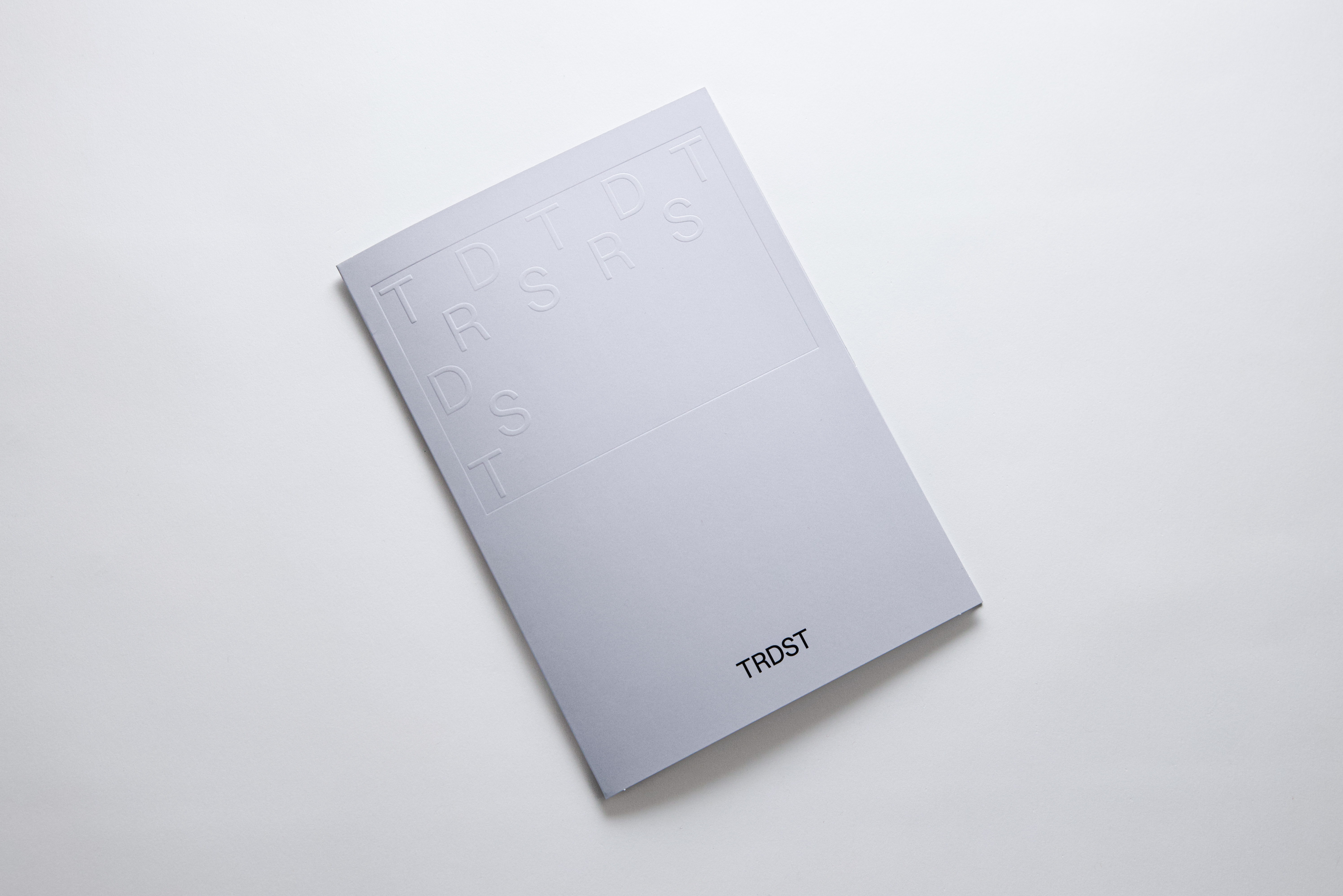
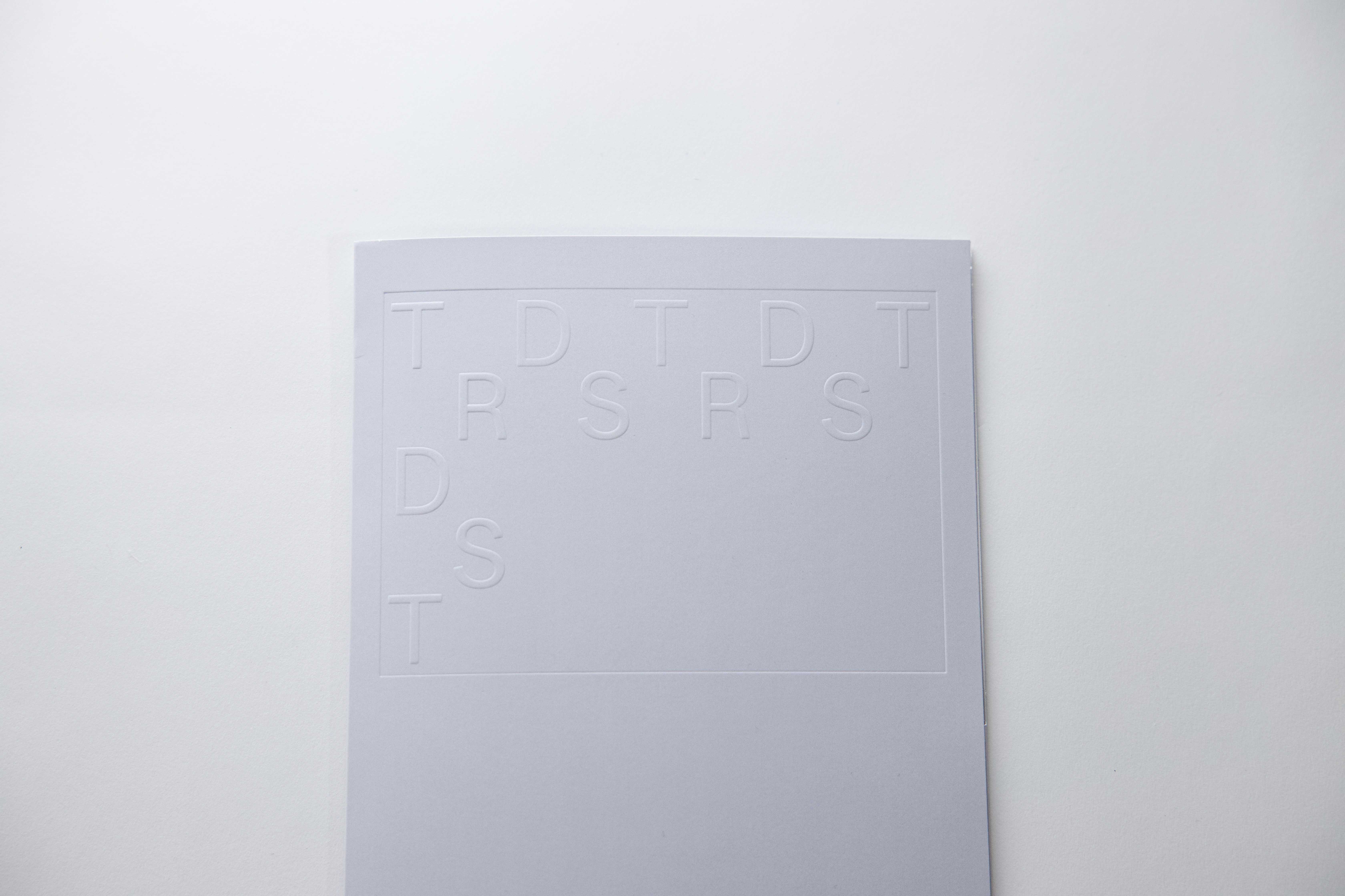

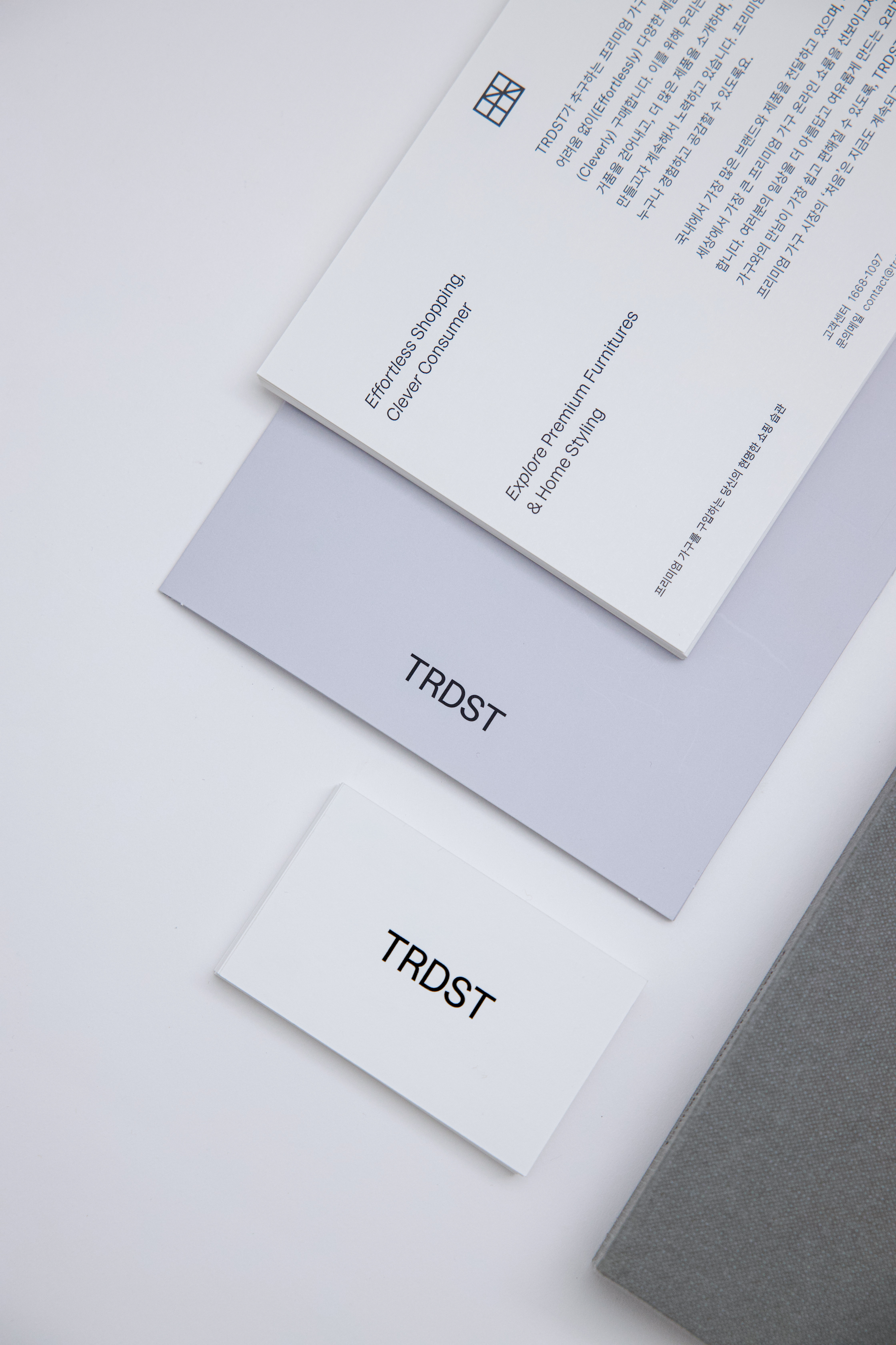

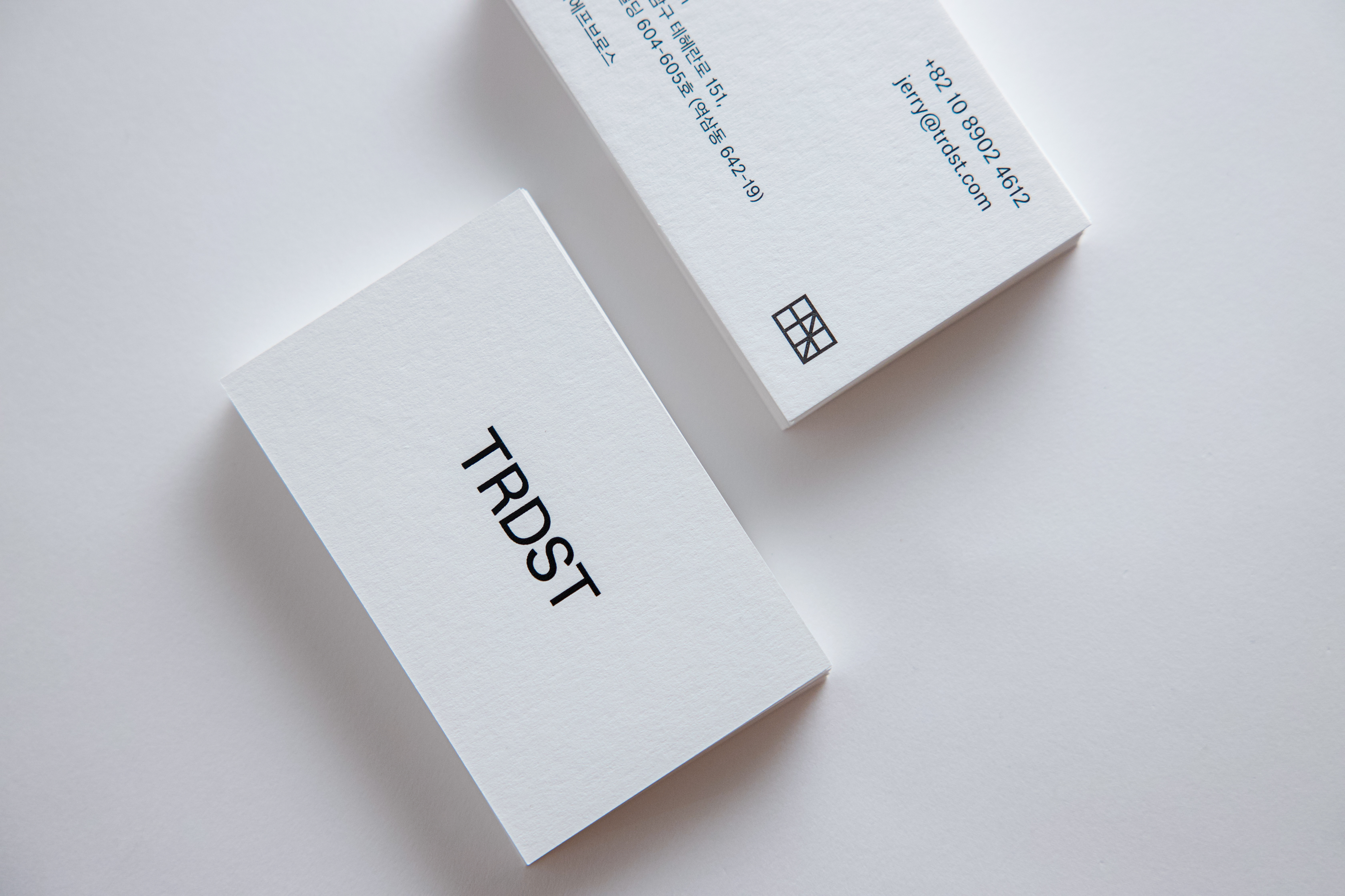
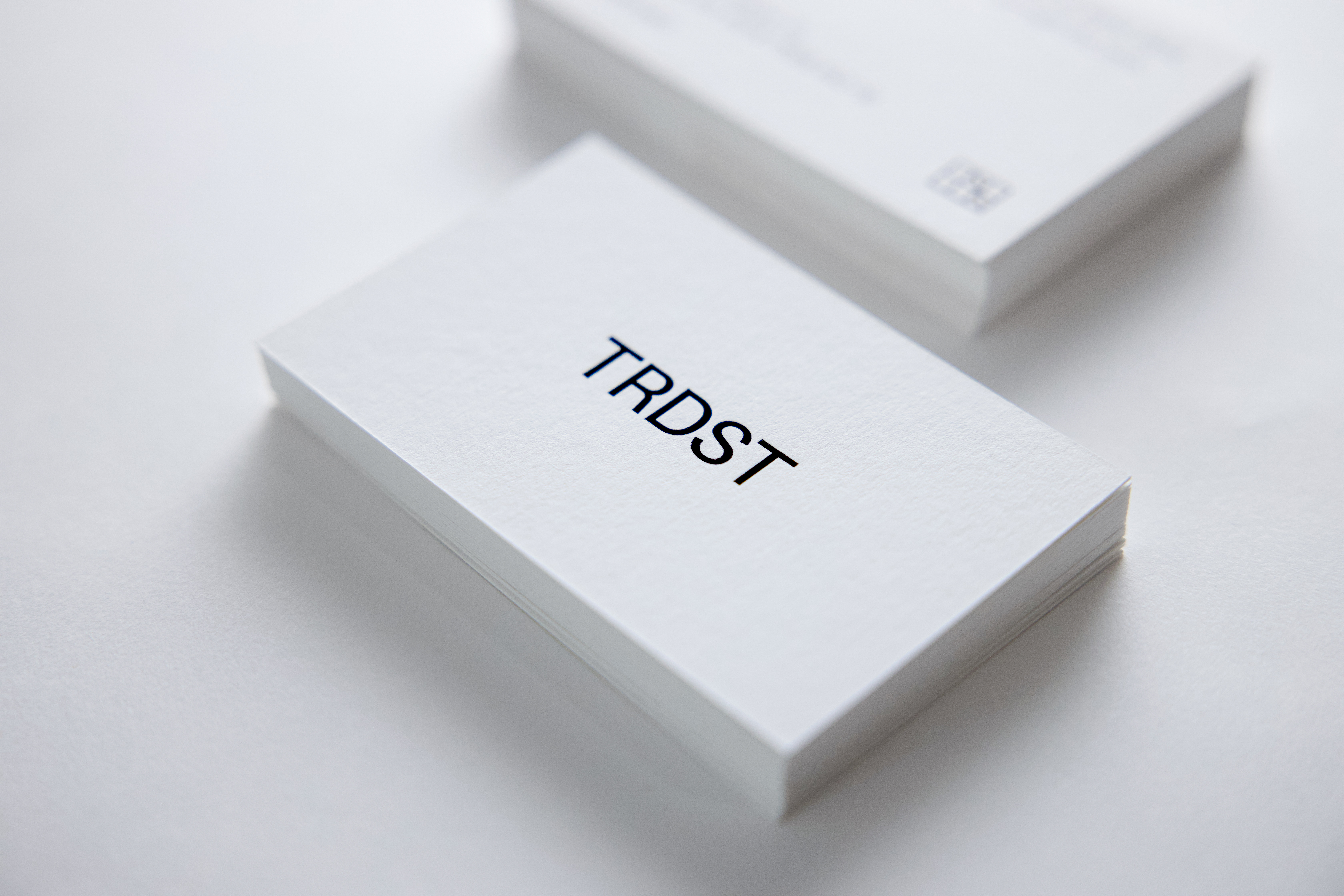
Symbol, business card and postcard have the same size ratio.
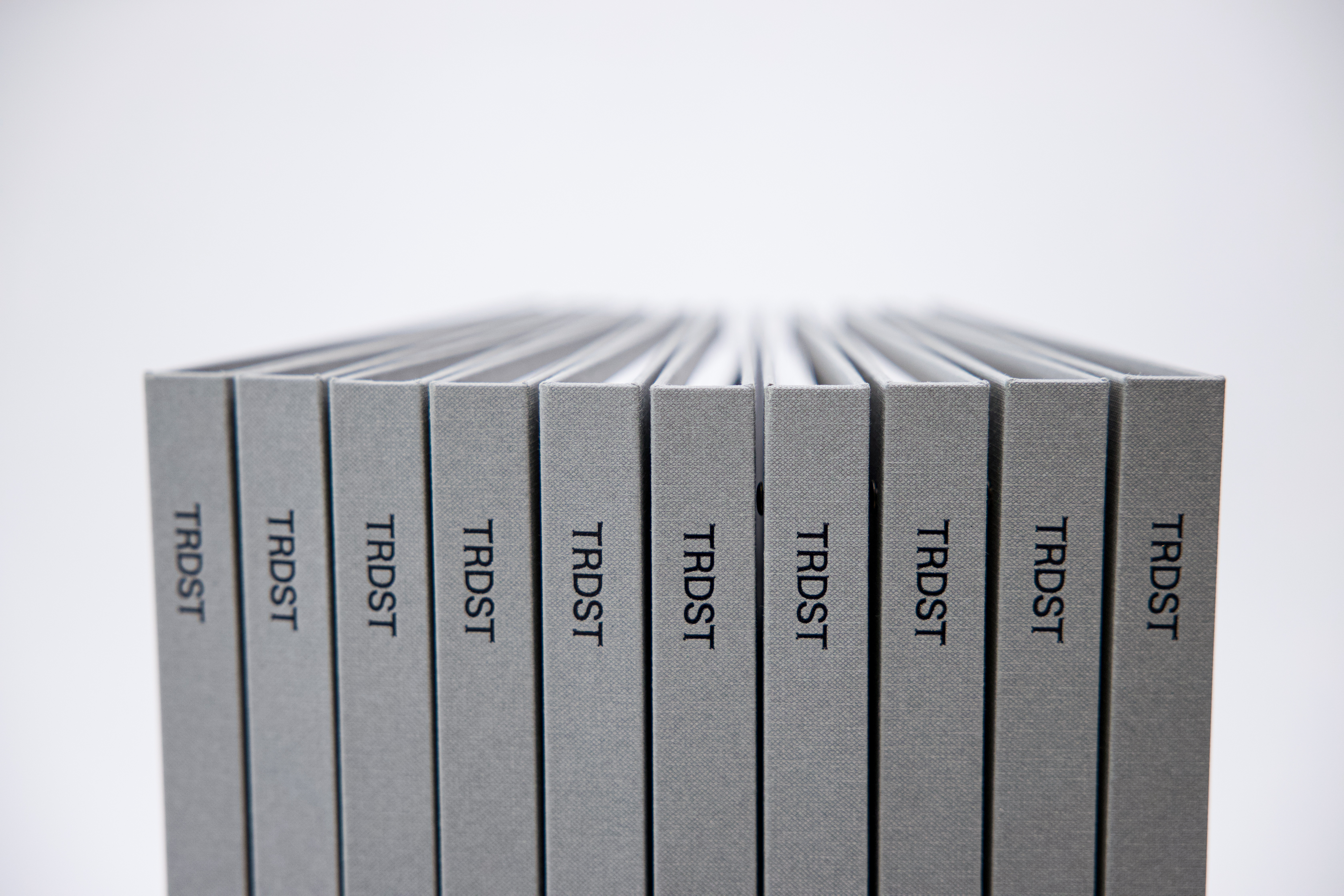

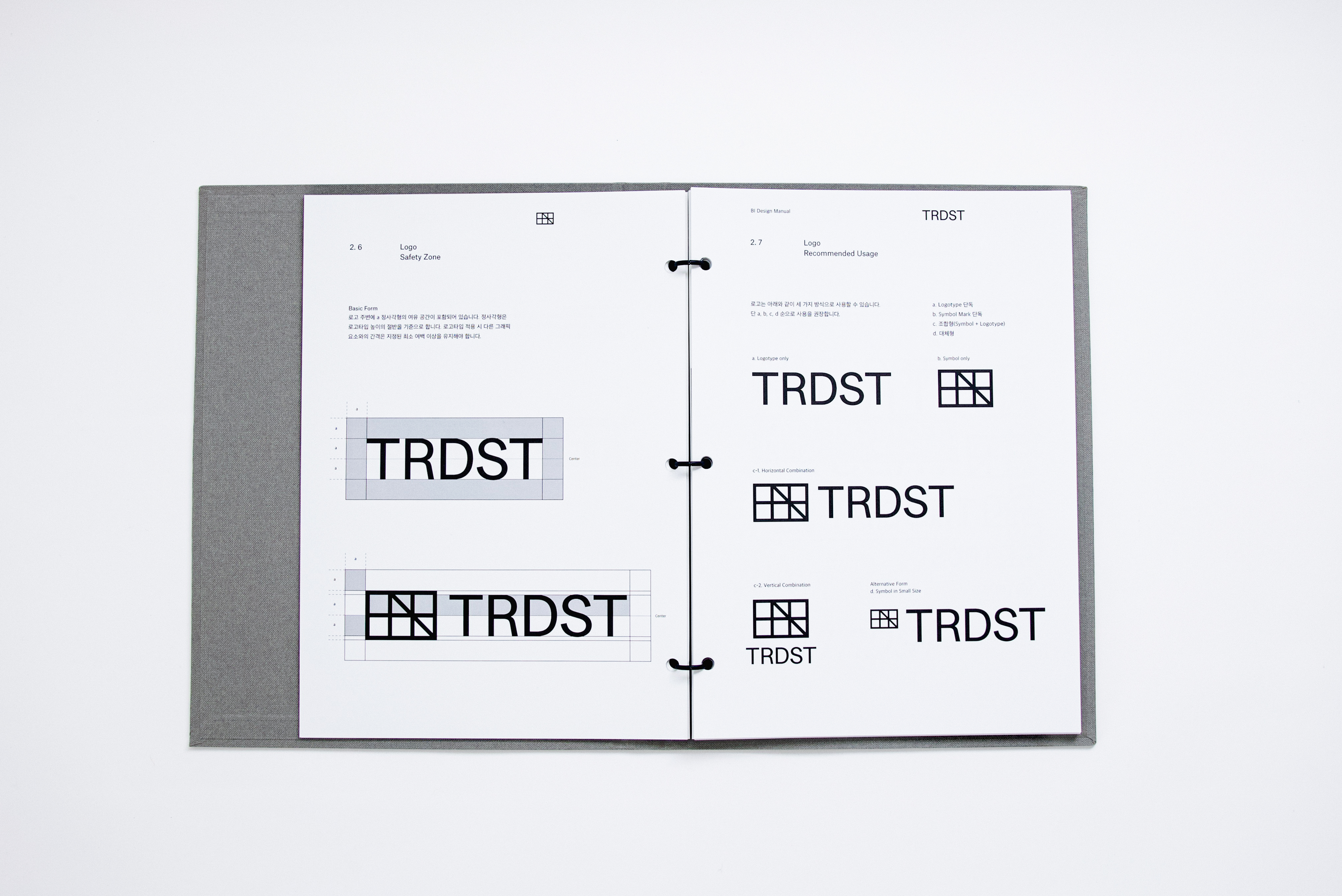
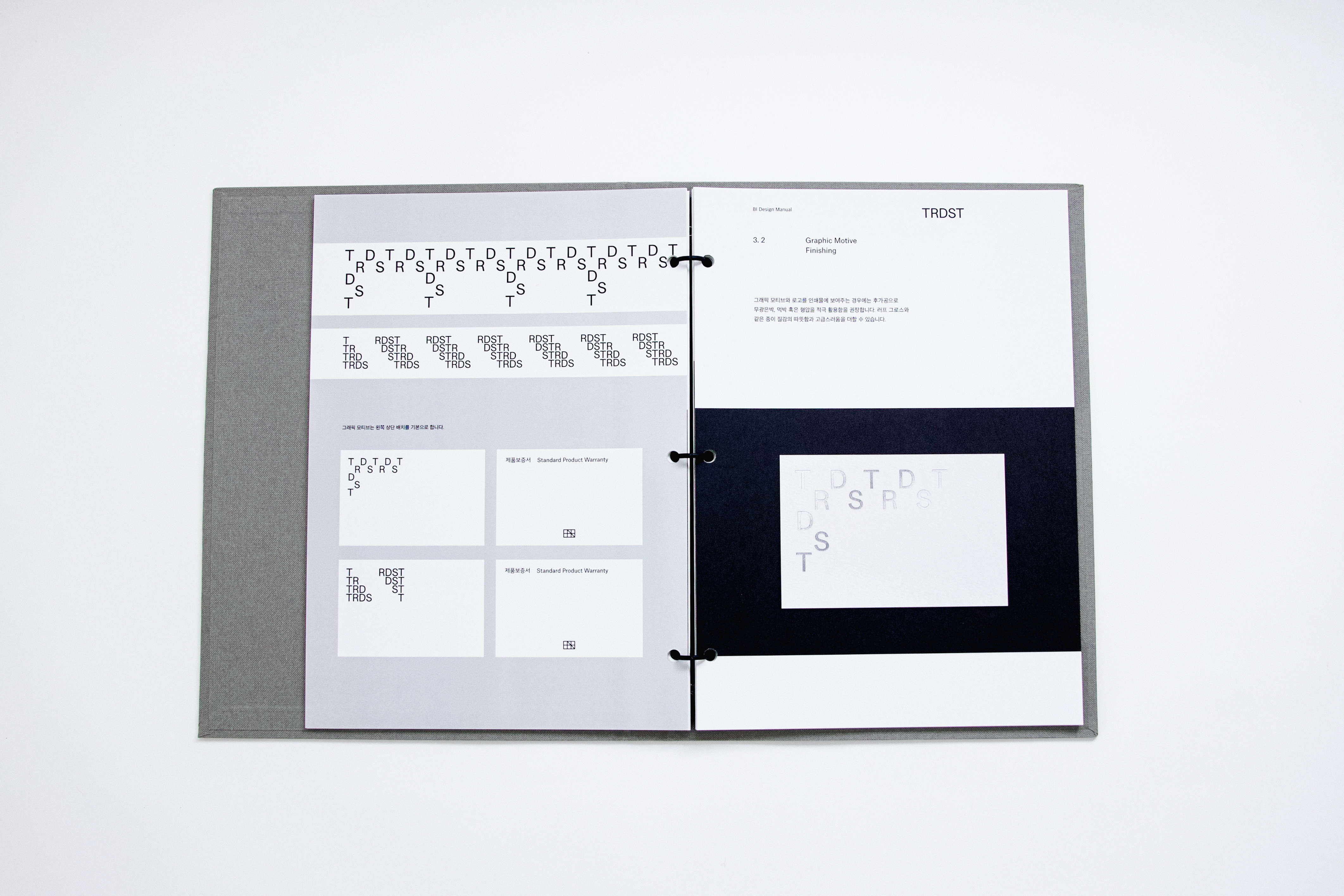
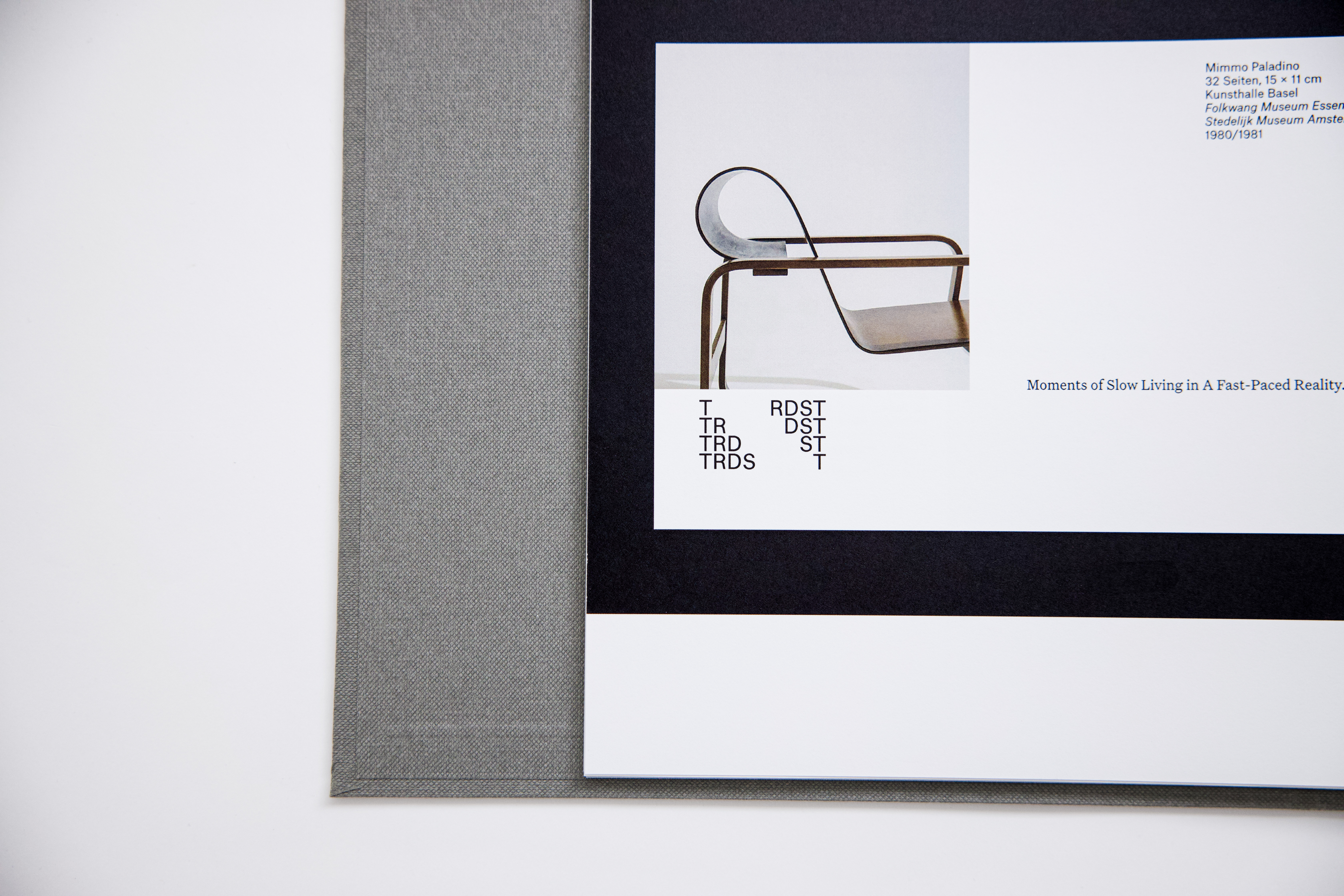
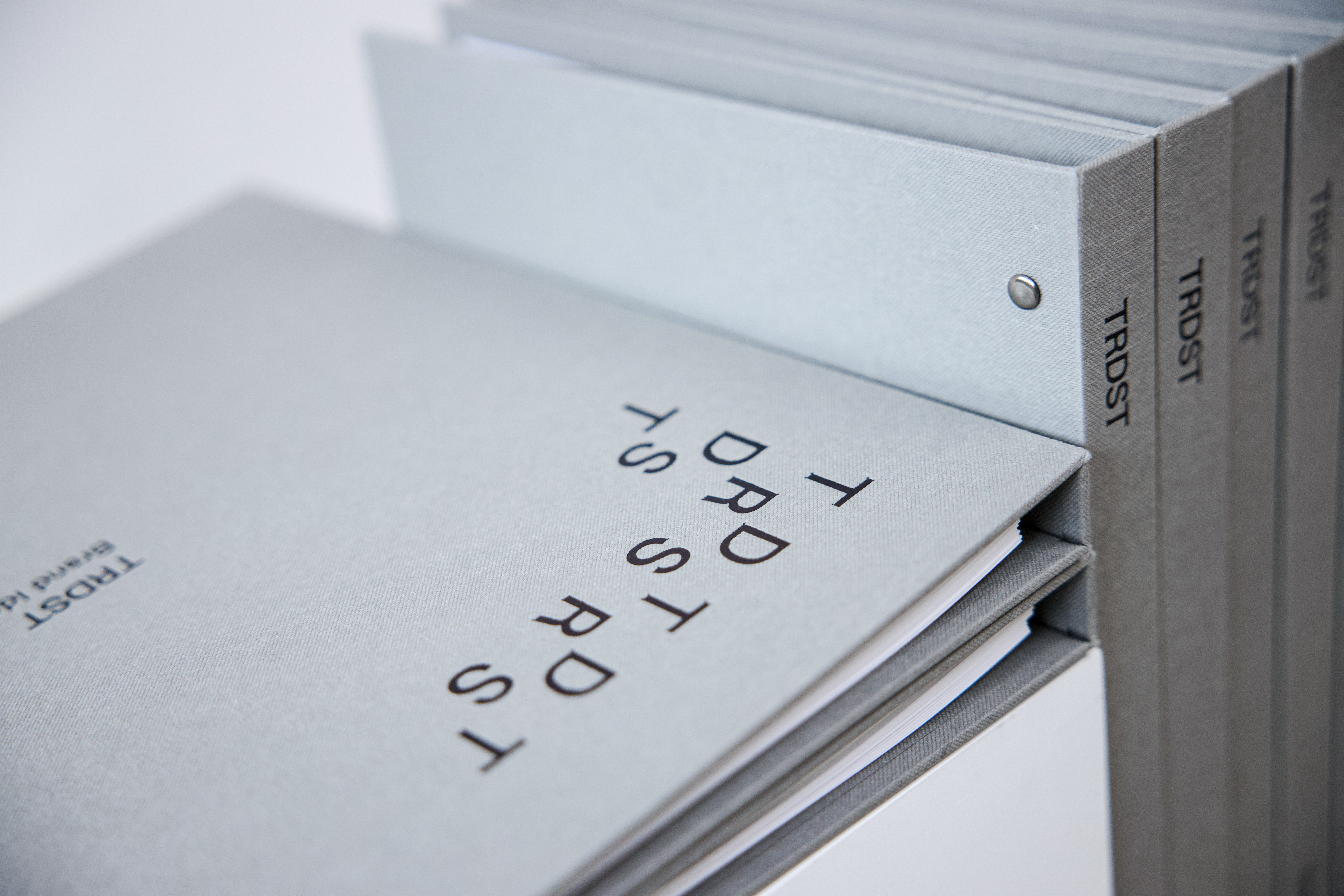
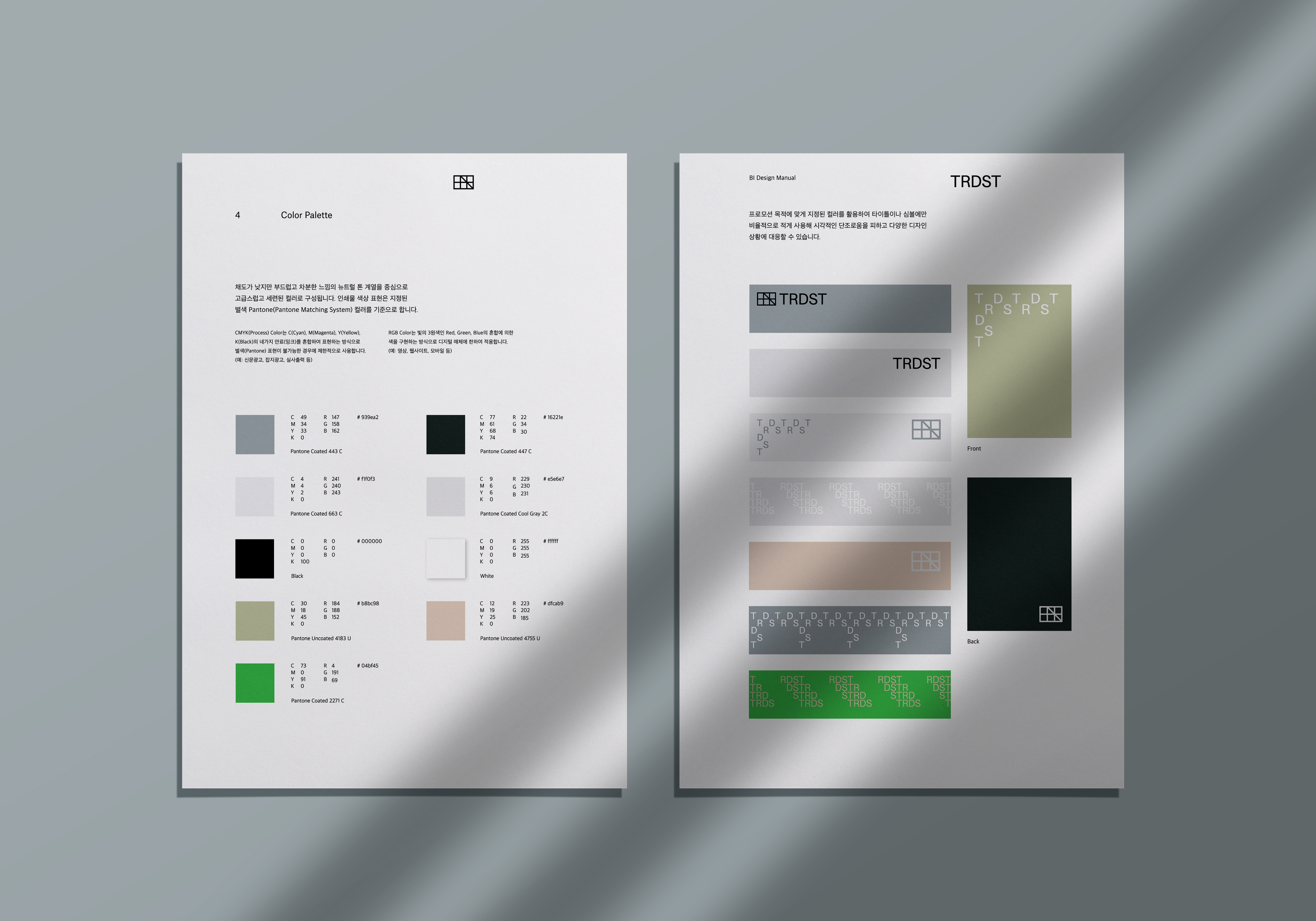
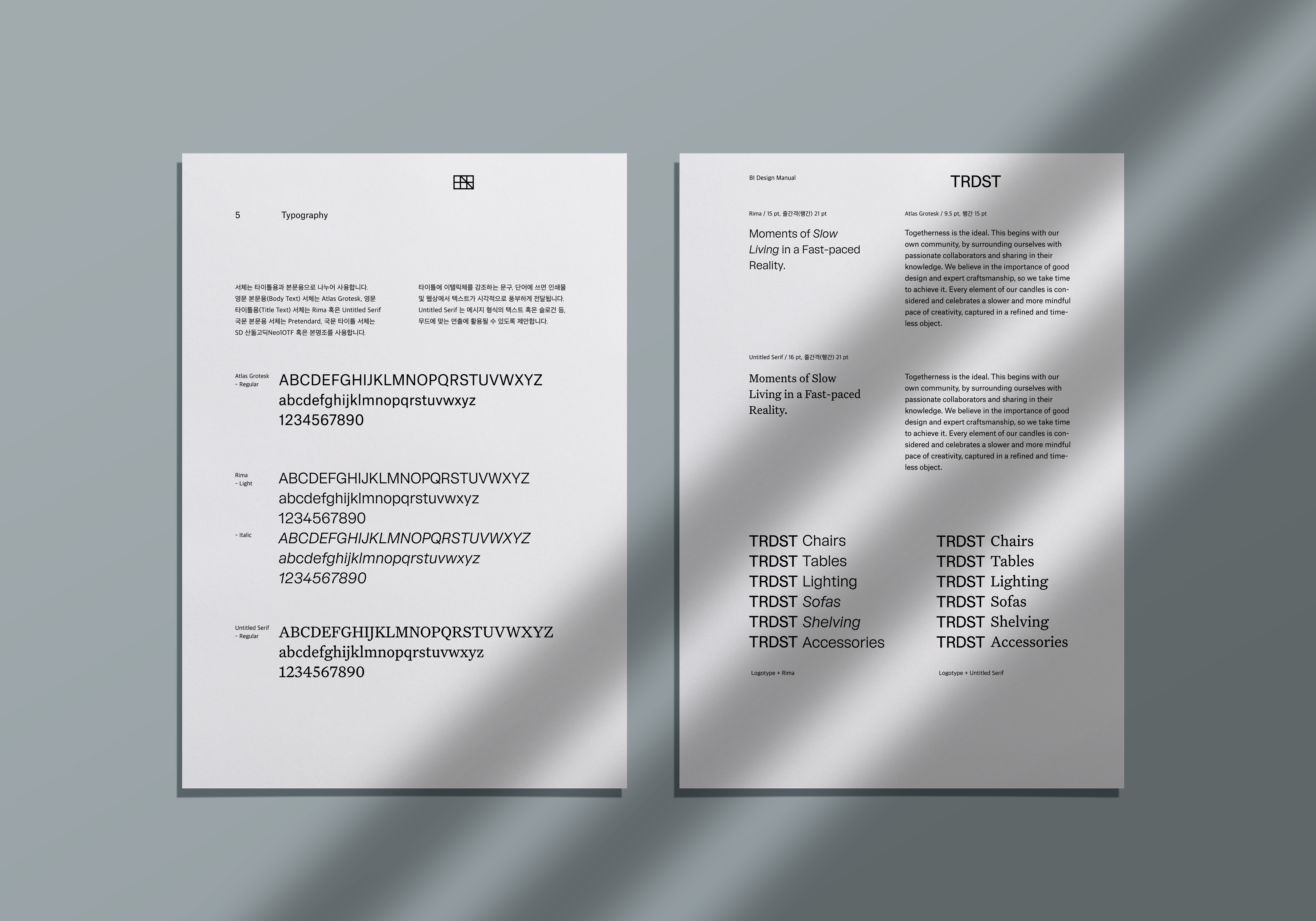
The identity establishes a new suite of logos, colour palette and typographic scheme for TRDST, applied across website and print. Also we developed on the design guidelines for the website and mobile.
Typeface for typography
ENG
Atlas Grotesk
Rima
Untitled Serif
KOR
SD Sandol Gothic Neo1
Noto Serif
Pretendard


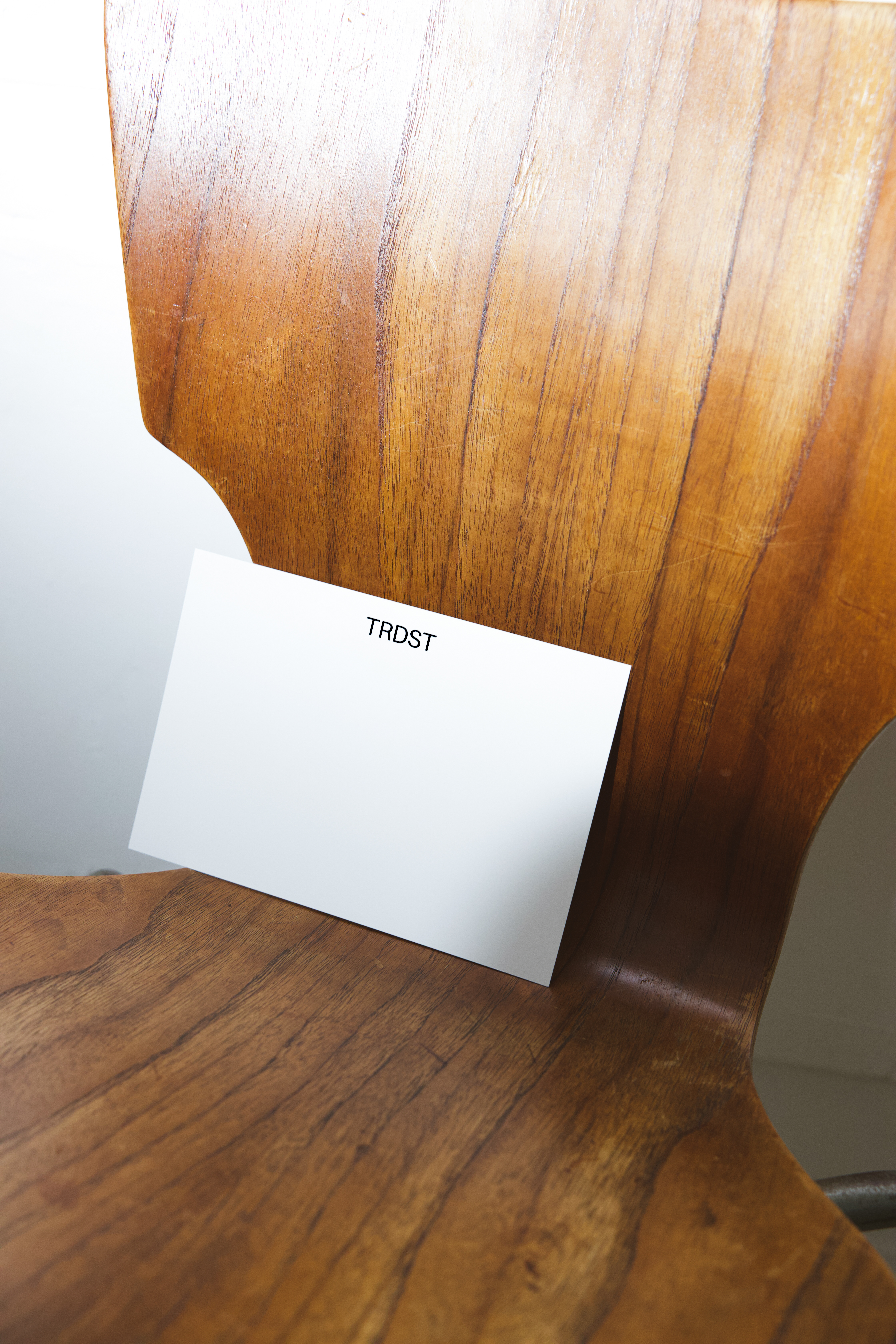
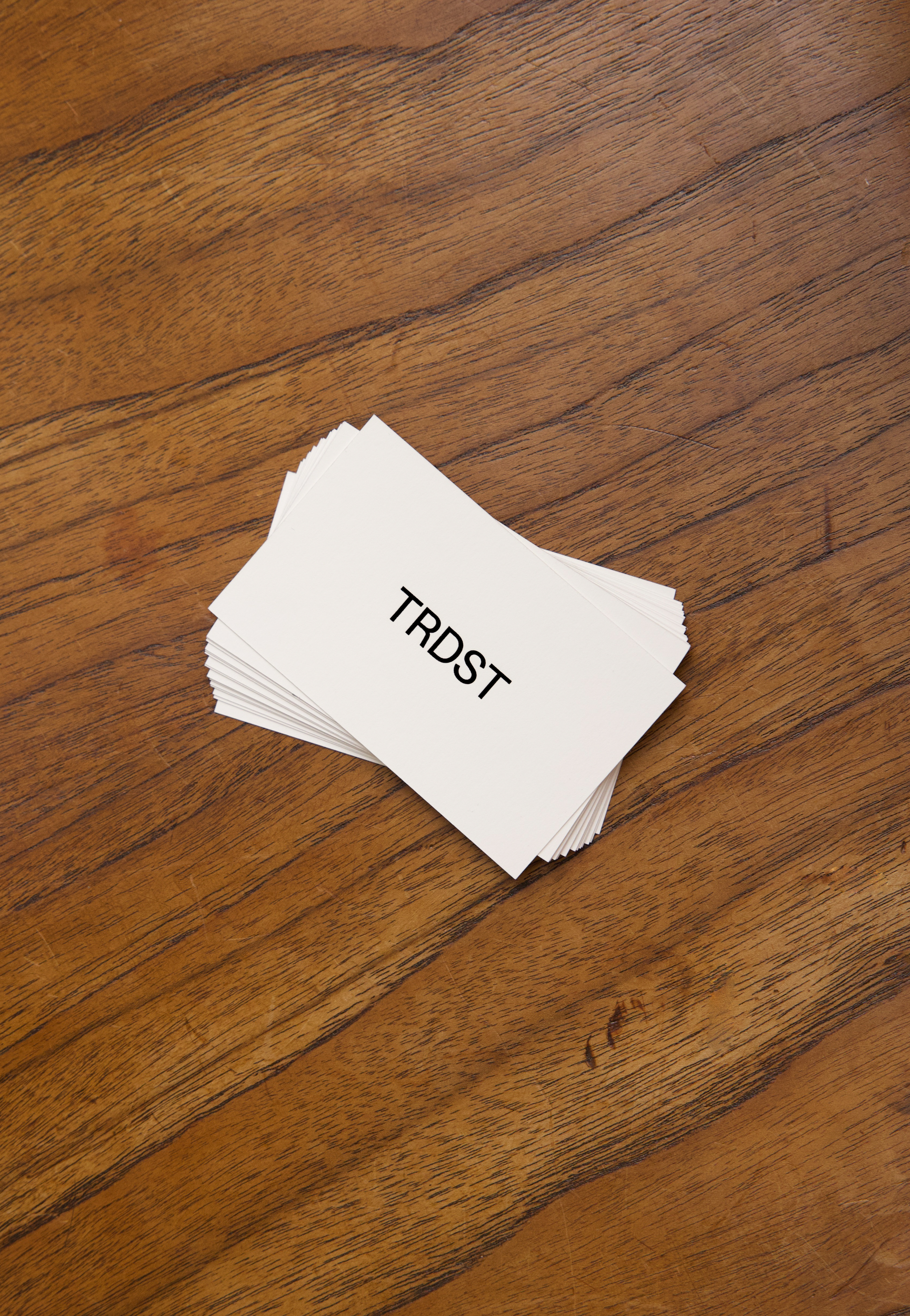


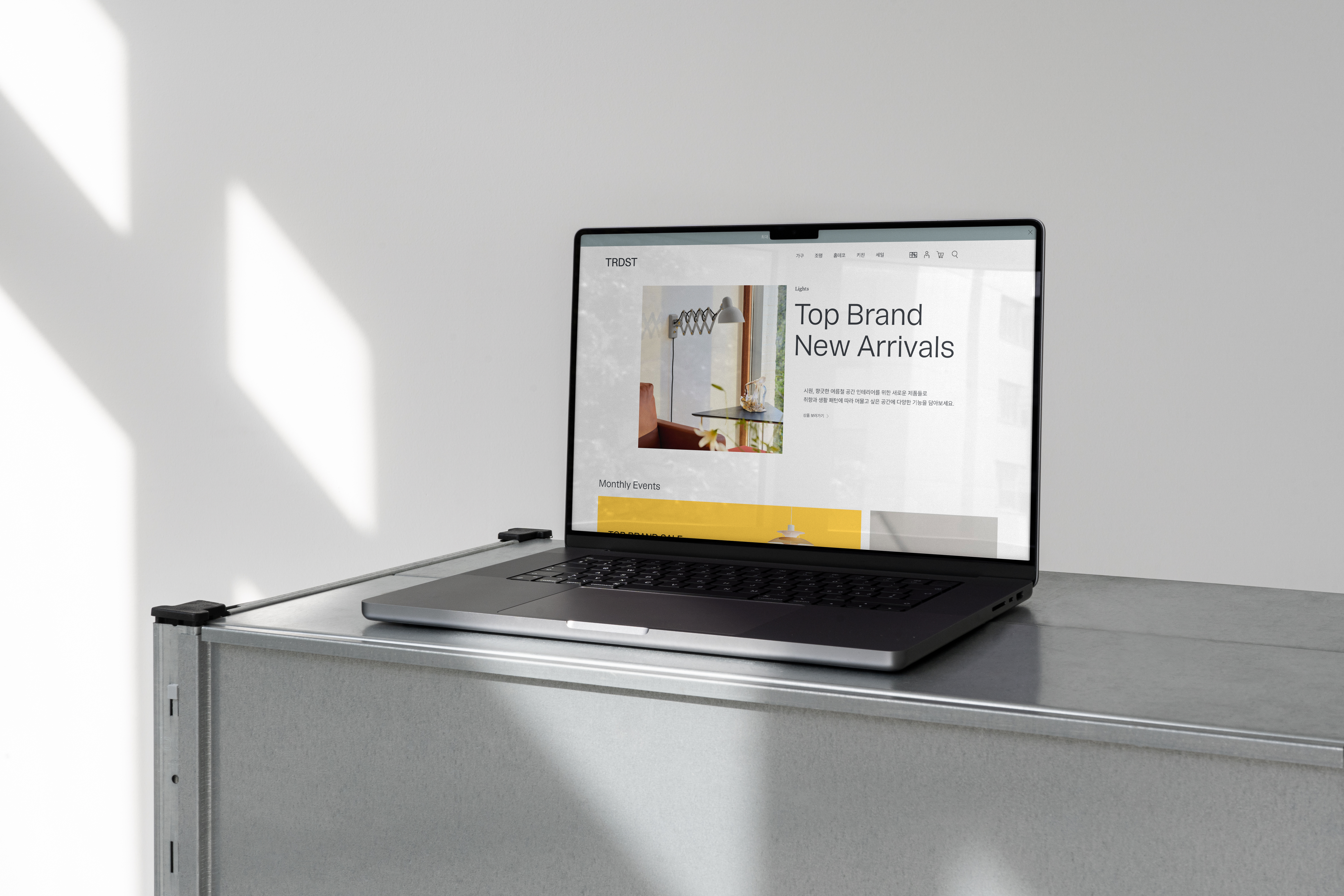



Identity, design guideline, print and website (2022)
Brand Manual Book
Hard-cover folder, 48 pages
Business card, Postcard and Paperfolder
Client: CDF Bros Corporation
Brand Manual Book
Hard-cover folder, 48 pages
Business card, Postcard and Paperfolder
Client: CDF Bros Corporation
Collaboration for logotype, symbol and business card with Sohee Kim
Photography: Sol Studio
Photography: Sol Studio